


Cartographic Symbolization Designer
Design professional cartographic symbol systems for ArcGIS and QGIS maps

What You Can Do
You'll design symbol systems that transform raw GIS data into clear, professional maps where stakeholders instantly grasp spatial relationships and data patterns. This skill guides you through establishing visual hierarchies, selecting appropriate color schemes, optimizing symbol legibility across formats, and ensuring accessibility compliance. Whether you're creating zoning overlays, infrastructure networks, or demographic visualizations, you'll develop consistent symbolization standards that work across ArcGIS and QGIS platforms for both print and digital publication.
Features
establish primary, secondary, and tertiary visual weight using size, color, and pattern to guide viewer attention
implement appropriate classification methods (categorical, ordinal, quantitative) that match your data type and audience
choose perceptually uniform palettes optimized for colorblind accessibility and print reproduction
test and refine symbols across output scales, resolutions, and formats to ensure clarity in reports and presentations
balance competing symbols across overlapping datasets without visual interference or cognitive overload
ensure symbol specifications translate correctly between ArcGIS and QGIS software environments
adapt symbol systems for both publication-quality printed maps and web/screen-based viewing
create reusable symbol libraries and style guides for consistent application across map series
Example Output
Example 1: Zoning Overlay Map
- Base layer: Parcel boundaries (light gray, 0.5pt stroke)
- Primary layer: Zoning districts (distinct hues: residential=blue, commercial=orange, industrial=red, with 40% transparency)
- Secondary layer: Protected areas (diagonal hatch pattern, green outline)
- Tertiary layer: Infrastructure corridors (thin lines, appropriate colors by type)
Example 2: Infrastructure Asset Map
- Water mains: Blue lines, thickness varies by diameter (8", 12", 24" specifications)
- Sewer lines: Brown lines with direction arrows
- Gas lines: Yellow lines with service area buffer
- Maintenance status: Symbol variation (solid=good condition, dashed=needs repair, dotted=planned replacement)
Example 3: Population Density Choropleth
- Sequential color ramp: light yellow → dark purple representing 0-5000+ people/sq mi
- Darker saturation = higher density with clear visual progression
- Legend includes sample swatches with accessibility note for colorblind viewers
What's Included
- SKILL.md instruction file: complete symbolization methodology and decision framework
- Symbol specification template: standardized format for documenting color codes, line weights, patterns, and transparency values across ArcGIS and QGIS
- Color palette library: 8-10 pre-tested perceptually uniform color schemes optimized for colorblind accessibility and print reproduction
- Visual hierarchy checklist: step-by-step guide for assigning visual weight and prioritizing layers
- Cartographic standards checklist: validation criteria for legibility, accessibility, and professional presentation across map products
Who It's For
- GIS Analysts — designing maps for planning departments, municipal reports, and public engagement materials
- Urban Planners — creating zoning maps, comprehensive plan visualizations, and land-use studies
- Cartographers — establishing symbol systems for recurring map series and multi-format publication
- Planning Directors — ensuring cartographic consistency and professional standards across all planning documents
- Environmental/Transportation Analysts — communicating spatial data to diverse stakeholder audiences through clear visual systems
Best For
- Designing symbol systems for multi-layer planning maps (zoning, infrastructure, demographics)
- Creating publication-quality maps for bond measures, environmental reviews, and planning documents
- Establishing cartographic standards and style guides for recurring map series
- Migrating or translating symbol specifications between ArcGIS and QGIS platforms
- Optimizing existing maps that stakeholders report as confusing or hard to interpret
- Ensuring accessibility compliance (colorblind-friendly, print-legible) across map products
You might also like
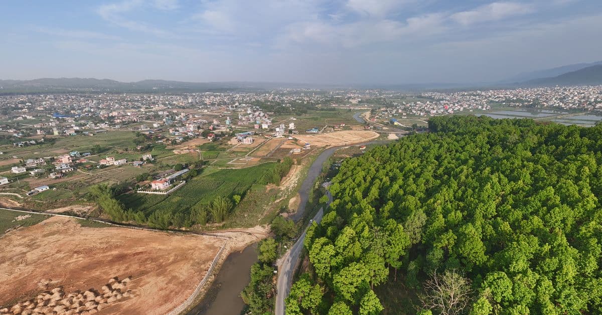
You can conduct comprehensive land use compatibility assessments that identify vertical and horizontal conflicts between proposed developments and surrounding uses. The skill helps you evaluate zoning compliance, assess adjacency impacts, document regulatory alignment, and develop evidence-based mitigation strategies that withstand planning commission and city council scrutiny.

You can synthesize coastal datasets (tide gauges, LIDAR, bathymetry, historical shorelines) to quantify erosion trends and sea-level rise impacts. Claude builds deterministic and probabilistic inundation projections, assesses infrastructure vulnerability, and translates technical analysis into policy-relevant findings that satisfy state coastal zone management and NEPA/CEQA compliance requirements for development approvals and adaptation investments.

This skill structures the variance analysis process to ensure consistency, reduce bias, and create audit trails that justify approvals or denials based on established legal standards. You'll generate comprehensive reports that document substantial difficulty claims, unique circumstances, hardship justifications, and condition frameworks that withstand administrative review and potential legal challenge.
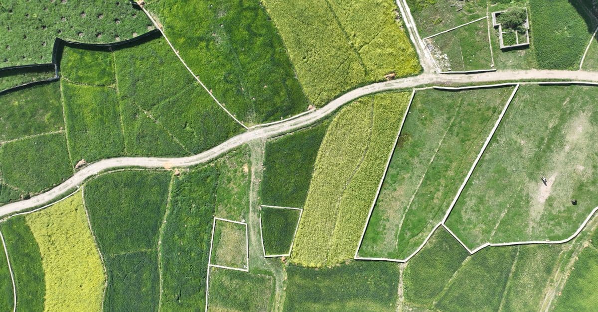
You can systematically design spatial analysis workflows that integrate vector data (zoning boundaries, infrastructure networks, parcel geometries) with raster datasets (elevation models, land use classifications, accessibility surfaces). The skill provides validation protocols to identify data resolution conflicts, projection misalignments, overlay logic errors, and output specification issues before analysis execution. You'll communicate complete analysis specifications to technical teams and stakeholders with confidence that the workflow methodology is sound.

You can identify slow spatial queries, analyze PostGIS execution plans, design optimal spatial indexes (GIST, BRIN, SP-GIST), and restructure database schemas for efficient land use analysis, zoning verification, and infrastructure mapping. This skill helps you troubleshoot why intersection queries timeout, optimize buffer operations on large feature classes, and accelerate web mapping service delivery without requiring application code changes.

You can systematically design engagement strategies that move beyond checkbox consultation to genuine stakeholder co-creation. Claude helps you develop structured dialogue frameworks, identify underlying community concerns versus stated objections, anticipate conflicts between community priorities and project feasibility, and create communication materials that resonate across diverse education levels, languages, and media preferences. This skill guides you through multi-phase engagement planning, equity-focused participation design, and documentation of engagement quality for municipal approvals.

You can systematically evaluate existing transit networks to quantify performance gaps, forecast demand patterns under different scenarios, and develop optimization strategies backed by data. The skill helps you identify underperforming corridors, model service changes before implementation, pinpoint infrastructure gaps, and build stakeholder-ready arguments for transit investment decisions with supporting analysis.

Transform violation complaints and site inspection data into standardized, defensible enforcement documentation. You can rapidly assess violation severity, establish reasonable remediation timelines, prioritize enforcement actions across multiple violations, and generate compliance agreements that protect jurisdictional authority. The skill structures your analysis to create documentation suitable for both negotiated compliance and formal enforcement proceedings.