

Sketch Design System Documentation & Component Specifications
Create design system documentation and specs from Sketch
What You Can Do
You transform Sketch design files into production-ready design system documentation and component specifications. Claude analyzes your Sketch designs and generates comprehensive developer handoffs—component catalogs, design tokens, responsive behavior specs, and accessibility guidelines—eliminating manual documentation work and ensuring design-to-development accuracy.
Features
automatically catalog components with sizing, padding, stroke weights, and visual hierarchy
create CSS variables, spacing scales, typography definitions, and color palettes for developers to implement
organize reusable UI patterns with usage guidelines and state variations (hover, active, disabled)
capture breakpoint rules, layout shifts, and adaptive patterns across screen sizes
analyze color contrast ratios, text hierarchy, and suggest ARIA patterns for component implementation
produce usage examples, HTML/CSS/React code snippets, and integration patterns
document typography hierarchy, logo usage rules, spacing systems, and visual language principles
Example Output
Component Specification Output:
## Button Component

### Sizing
- Small: 32px height, 12px horizontal padding
- Medium: 40px height, 16px horizontal padding
- Large: 48px height, 20px horizontal padding

### Design Tokens
- Background: var(--primary-500)
- Text: var(--neutral-white)
- Hover: var(--primary-600)
- Disabled Opacity: 0.5

### States
| State | Background | Border | Cursor |
|-------|-----------|--------|--------|
| Default | Primary 500 | None | pointer |
| Hover | Primary 600 | None | pointer |
| Active | Primary 700 | None | pointer |
| Disabled | Neutral 200 | None | not-allowed |

### Accessibility
- Minimum touch target: 44×44px (WCAG 2.1)
- Color contrast: 4.5:1 (AA standard)
- Focus state: 2px blue outline
What's Included
- *Skill package includes:**:
- SKILL.md: Complete Claude workflow for analyzing Sketch designs and generating documentation
- Design System Specification Template: Reusable markdown format for component specs
- Design Token Export Template: CSS variables and token documentation structure
- Handoff Guide Template: Developer-ready implementation documentation
- Accessibility Audit Checklist: WCAG compliance verification workflow
- Component Inventory Spreadsheet Template: Categorization and tracking
- Brand Guidelines Generator: Logo, typography, color palette documentation workflow
Who It's For
- Design System Managers — automate the creation and maintenance of component documentation
- UX/UI Designers — translate Sketch designs into developer-friendly specifications
- Frontend Developers — receive accurate, detailed implementation guidelines from design files
- Design Leads — audit design consistency and ensure design language adherence
- Product Managers — facilitate seamless design-to-development handoffs and reduce back-and-forth
Best For
- Creating comprehensive design system documentation from existing Sketch files
- Generating design token libraries and CSS variable specifications
- Building component catalogs with usage guidelines and code examples
- Documenting responsive behavior and breakpoint strategies
- Performing design-to-development handoffs with complete specifications
- Auditing design consistency across large component libraries
- Establishing brand guidelines and visual language documentation
You might also like

Get instant expert guidance on setting up remote broadcast gear, troubleshooting signal problems, and solving connectivity issues before they derail your show. You describe your equipment, network conditions, or specific error, and receive actionable diagnostics and step-by-step fixes tailored to your exact broadcast scenario.
 by majiayu000
You generate production-ready design briefs from client requirements, automatically check dozens of designs for brand consistency violations, and orchestrate batch workflows with approval checkpoints. This skill ensures every design aligns with your brand guidelines while accelerating your design approval cycle by weeks.
by majiayu000
You can architect scalable component systems in Framer that maintain design consistency across projects. Claude helps you establish reusable patterns, manage component variants systematically, and generate comprehensive design system documentation that bridges design and code.
by majiayu000
You can rapidly produce news stories from research to publication, automatically optimizing content for web, social media, and email platforms. Claude helps you generate SEO-friendly headlines, craft engaging social snippets, structure compelling narratives, and manage your publishing workflow—all while maintaining editorial quality and deadline pressure.
by majiayu000
You can organize intricate multi-track timelines with nested sequences, manage high-resolution and proxy workflows, and generate detailed technical specifications for multi-format delivery across broadcast, streaming, and archival standards. Claude analyzes your project structure, tracks media dependencies, and creates implementation roadmaps that ensure smooth handoff to colorists, sound designers, and delivery teams.
by majiayu000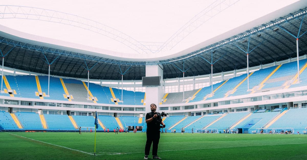
Generate polished sports segment scripts complete with stat callbacks, narrative hooks, and compelling angles — in minutes instead of hours. Get interview question briefs with talking points and live ad-lib suggestions that keep your anchors prepared and articulate. Transform raw game data and story ideas into broadcast-ready copy your newsroom will love.
by majiayu000
You can load existing PRDs or saved prompts, discuss targeted improvements with Claude, and refine requirements without losing track of what changed. The skill manages source discovery, guides you through iteration cycles, and maintains clear modification markers ([ADDED], [MODIFIED], [REMOVED], [UNCHANGED]) so you always know what evolved during refinement.
by majiayu000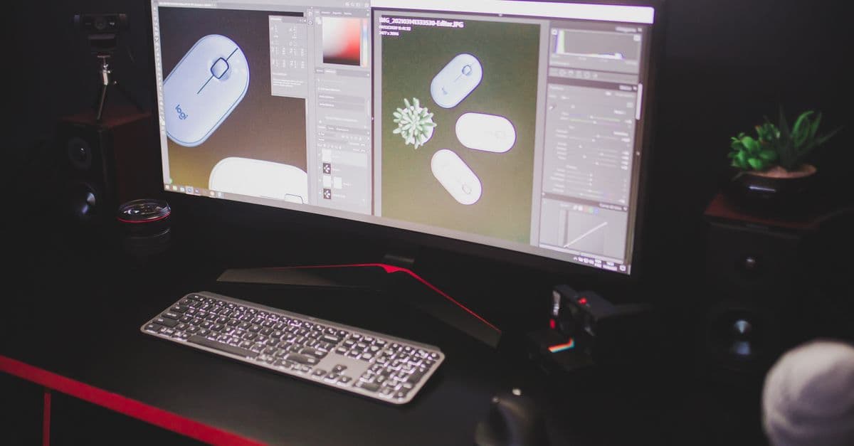
Analyze your Premiere Pro projects to identify performance bottlenecks, memory issues, and rendering inefficiencies. You'll receive targeted optimization recommendations, automation scripts, and troubleshooting guidance tailored to your specific system configuration and project complexity. Claude becomes your technical production consultant, helping you resolve crashes, slow timelines, and resource conflicts.
by majiayu000