

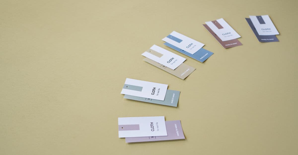
Brand Identity System Designer
Build auditable brand systems that scale across all touchpoints
What You Can Do
Generate comprehensive brand identity systems that establish visual consistency and strategic coherence across your entire product ecosystem. You'll receive detailed specifications for color palettes (with accessibility analysis), typography systems, component libraries, and full brand guidelines that your team can implement immediately in your design tools. The system ensures every touchpoint—from web to mobile to print—reflects your brand strategy and maintains consistency at scale.
Features
Define size, weight, and spacing relationships that create clear information structure across all applications
Generate cohesive color systems with WCAG contrast ratios verified, ensuring readability for all users
Establish font families, sizes, line heights, and weights that work harmoniously across devices and contexts
Design reusable component specifications including states, variants, and interaction patterns for consistency
Generate exportable tokens (JSON, CSS variables) that sync your design system across code and design tools
Create comprehensive, auditable guidelines with usage rules, dos and don'ts, and real-world application examples
Define measurable criteria to evaluate whether existing designs comply with your brand system
Establish governance patterns for evolving your system while maintaining backward compatibility
Example Output
Color Palette System
- Primary:
#2563FF| Usage: CTA buttons, links, primary navigation - Secondary:
#7C3AED| Usage: Accents, highlights, secondary actions - Neutral Scale:
#F8FAFC→#0F172A| Usage: Backgrounds, surfaces, text - Semantic: Success
#16A34A, Warning#F59E0B, Error#EF4444
Typography Scale
- Display (48px, Bold): Headline primary use
- Heading 1 (32px, Semibold): Section titles
- Body (16px, Regular): Standard text, 1.6 line height
- Caption (12px, Regular): Metadata, timestamps
Component Specs - Button (Primary)
- States: Default, Hover (80% opacity), Active (pressed), Disabled
- Sizes: Small (32px), Medium (40px), Large (48px)
- Spacing: 16px horizontal padding, 8px vertical
Brand Rules ✓ Always use approved typography only ✓ Maintain 8px baseline grid alignment ✓ Enforce contrast ratio ≥ 4.5:1 for text ✗ Don't remix color palette outside approved values ✗ Don't use drop shadows deeper than 12px blur
What's Included
- Brand Audit Framework: Structured methodology to evaluate your current visual language and identify gaps
- Color System Specification: Semantic color palette with hex values, usage guidelines, and WCAG contrast verification
- Typography Documentation: Font selections, scales, line heights, and application rules for all text roles
- Component Library: Detailed specifications for buttons, inputs, cards, navigation, and other UI patterns with states and variants
- Design System Guidelines: Complete brand guidelines including voice, visual rules, dos/don'ts, and real-world examples
- Design Tokens Export: Machine-readable tokens in JSON and CSS format for seamless integration into development and design workflows
Who It's For
- Brand & Design Strategists
- Product Design Leads
- Design System Managers
- Creative Directors
- Startup Founders & CTOs
Best For
- Building brand identity systems from scratch
- Scaling existing brands across multiple products
- Creating or auditing design systems
- Brand refresh and evolution projects
- Ensuring cross-team design consistency
You might also like

Create comprehensive KPI dashboards that track supply chain performance across cost, quality, delivery, and service metrics. Automate variance analysis to identify root causes of performance deviations and generate executive-level reports that translate operational data into actionable insights for leadership and stakeholders.
 by skillslib
You'll design robust SCADA system architectures, configure industrial protocols (Modbus, Profibus, OPC-UA, DNP3), and diagnose connectivity and performance issues across distributed control networks. Get step-by-step configuration guidance, integration workflows, and troubleshooting decision trees tailored to your specific hardware and protocol stack.
by skillslib
You can establish systematic color grading workflows that accelerate project delivery, ensure visual consistency across episodes and projects, and maintain broadcast-quality standards. Claude generates reusable templates, quality control checklists, and grading decision frameworks tailored to your project's color science and deliverable requirements.
by skillslib
You'll build complete activation funnels by analyzing user behavior, identifying conversion bottlenecks, and designing targeted onboarding campaigns. Claude creates customer journey maps, funnel stage definitions, engagement messaging frameworks, and A/B testing strategies tailored to your product and audience.
by skillslib
Use Claude to automate your entire collection workflow, from first touch to recovery, with legally sound escalation protocols. You'll recover more money in less time, reduce bad debt write-offs by 25-40%, and build defensible collection records that withstand legal scrutiny. Claude handles customized demand letters, compliance validation, debtor profiling, and escalation strategies tailored to account age, debtor behavior, and jurisdiction.
by skillslib
You can conduct comprehensive active transportation network audits that identify missing links, connectivity gaps, and underserved communities. Claude helps you prioritize infrastructure investments against limited budgets using equity screening, mode-share modeling, and cost-benefit analysis—producing client-ready documentation and stakeholder presentations that justify infrastructure decisions with quantitative evidence rather than assumptions.
by skillslib
This skill automates your entire editorial workflow from draft to publication, orchestrating peer reviews across your team while enforcing brand consistency checks. You can scale your publishing operations without adding staff by using Claude to synthesize reviewer feedback, validate editorial standards, and determine publishing readiness. Every piece maintains your brand voice and meets quality criteria before going live.
by skillslib
This skill helps you troubleshoot Wwise integration issues, diagnose audio performance bottlenecks, and generate comprehensive documentation for interactive audio specifications. You'll get step-by-step fixes for common implementation problems, performance optimization strategies, and best practices for audio systems across different game engines and platforms.
by skillslib